
Quick Answer
The best fintech dashboard website examples are Mercury for calm banking, Stripe for payment tables, Ramp and BILL for approval workflows, Brex for exception tracking, and Wise Business for fee clarity. Copy the pattern that fits your product: lead with the balance, show pending money, and use color only for status. Templates cover screens only, so your ledger logic, approval rules, and security decide the real cost. If your workflow does not fit a template, DevSouq, a custom finance software development company, offers a free scope review to map a cost efficient build.
Key Takeaways
- Lead with the verdict. The best fintech dashboards answer “am I okay?” first with a balance or net position, then show pending payments and alerts.
- Match the reference to your product. Use Mercury for calm banking, Stripe for tables and reporting, Ramp and BILL for workflows, Brex for exceptions, and Wise Business for fee clarity.
- Reserve color for status. Green, red, and amber should signal gains, losses, and warnings only, never decoration.
- Treat numbers as your main typography. Tabular figures, consistent decimals, and right aligned columns make amounts easy to compare.
- Design the pending state. Show where money is, what happens next, and when it will arrive, because vague “processing” labels create support tickets.
- Build to measurable standards. Aim for a text contrast ratio of at least 4.5 to 1 and a Largest Contentful Paint of 2.5 seconds or less.
- Remember that templates cover only the screens. Ledger logic, approval rules, integrations, and security decide the real cost and risk of a dashboard.
- Choose custom when your workflow is unique. A scoped build can be cost efficient when a generic product would force you to pay for features you will not use.
What a Fintech Dashboard Should Show
Strong fintech dashboards follow the same top to bottom logic. Check your own layout against this order:
- A verdict row. Total balance or net position with a trend. It answers “am I okay?” and uses the largest type on the page.
- Money in motion. Pending payments, transfers in flight, and items awaiting approval. Anything that will change the headline number belongs beside it.
- A cash flow view. Income against spending over time, with a period comparison.
- A transaction table. Dense, filterable, and sortable, with merchant, category, amount, and status.
- Alerts and exceptions. Failed payments, low balances, and policy flags, shown on the main view and not buried in a tab.
Each product type adds its own layer:
| Product type | Extra widgets it needs |
|---|---|
| Trading and investing | Portfolio P&L, allocation, watchlist, buying power |
| Lending | Payment schedule, delinquency buckets, payoff quote |
| Billing | Invoice status, failed payment recovery, revenue recognition |
| Insurance | Claim queue, premium schedule, reserve tracking |
| Developer platforms | Usage meters, request logs, environment switch |
Best Fintech Dashboards at a Glance
| # | Platform | Category | Signature pattern | Study it for |
|---|---|---|---|---|
| 1 | DevSouq Technologies | Custom finance software | Scoped, purpose built modules | Building a dashboard around your ledger |
| 2 | Mercury | Business banking | Editorial calm | Trust through restraint |
| 3 | Stripe | Payments | Tables and reporting | Data tables and drill downs |
| 4 | Ramp | Spend management | Work queues | Workflow first design |
| 5 | Brex | Corporate cards and spend | Exception first views | Density at enterprise scale |
| 6 | Wise Business | Cross border banking | Fee transparency | Multi currency balances |
| 7 | Revolut Business | Business banking | Dark, card based UI | Numeral legibility on dark |
| 8 | Plaid | Data infrastructure | Developer console | Usage and health states |
| 9 | Robinhood | Investing | Focused portfolio view | Simplicity for new users |
| 10 | BILL | Bill pay and payables | Approval trail | Easy bill pay workflows |
Ten Fintech Dashboard Examples Analyzed
Product dashboards sit behind logins, so these notes rely on public product pages, demos, and documentation. Verify each feature against the vendor’s current site before citing it.
1. DevSouq Technologies: Custom Finance Dashboards Built Around Your Workflow

Best for: Finance teams whose dashboard has to sit on top of a ledger, billing engine, loan book, claims system, or portfolio data, and who want a scoped, cost efficient build around their own workflow instead of a generic product.
Every other entry here is a finished product you adopt as it comes. DevSouq is a leading custom finance software development company that builds the dashboard and the system underneath it. That difference matters when your data model does not fit a generic template. A standard product gives you its screens, its workflow, and its limits. A custom build starts from your ledger, your approval rules, and the questions your finance team asks every morning.
When a custom dashboard makes sense
Off the shelf tools work well when your process is common. Trouble starts when it is not. A finance team may reconcile payments across several internal systems. A lender may run payment rules that differ by product. An insurer may tie premiums to policy data. In each case a template dashboard ends up patched with exports, spreadsheets, and manual checks, and those workarounds carry their own cost in time and errors.
Why it suits budget conscious teams
- Cost efficient by scope. You pay for the modules your workflow needs, not for a suite of features you will never open.
- No per seat licensing pressure. A purpose built system is not priced by the number of finance users who log in, so growth does not automatically raise the bill. Confirm the commercial terms during your scope review.
- Built on your rules. Approval limits, payment schedules, and reporting logic are implemented as your business defines them, not approximated with settings.
- Fewer workarounds. When the dashboard reads directly from the system of record, teams spend less time exporting and rechecking numbers.
Finance areas covered
| Dashboard need | Underlying system | Related service |
|---|---|---|
| Ledger, reconciliation, financial reporting | Accounting engine | Custom accounting software |
| Subscriptions, invoices, failed payment recovery | Billing engine | Custom recurring billing software |
| Payment schedules, delinquency, payoff quotes | Loan book | Custom loan servicing software |
| Holdings, allocation, performance reporting | Portfolio engine | Custom investment portfolio software |
| Claim intake, triage, settlement tracking | Claims workflow | Custom claims management software |
How to test the fit
A scope review is a practical first step before any build begins. Bring your current workflow, the reports people ask for most, and the systems the dashboard must read from. The outcome should be a short list of modules to build first and a clear view of what can stay as a standard tool.
Pattern to borrow: design the data model first and the screens second. A dashboard is only as trustworthy as the system of record behind it.
2. Mercury
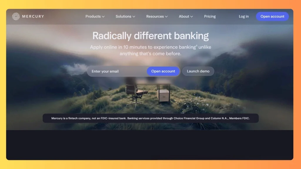
Best for: Startups and small to mid size businesses that want a calm, easy to read banking dashboard for balances, cards, payments, and team permissions, without the clutter of a traditional bank portal.
Mercury is a financial technology company, not a bank. Its banking services are provided through partner banks. Its interface is a benchmark for visual restraint: accounts, cards, and cash flow share one consistent voice, and dense transaction tables stay scannable through type discipline and not decoration.
What makes it work
- A narrow palette. Color is used sparingly, so the few colored elements on screen carry meaning.
- Generous spacing. Rows and cards have room to breathe, which lowers the effort of scanning long lists of transactions.
- One consistent voice. Accounts, cards, and payments follow the same layout logic, so users learn the product once and apply it everywhere.
- Numbers first. Balances and amounts get the strongest visual weight, and supporting labels stay quiet.
| Dashboard area | What it does |
|---|---|
| Accounts overview | Balances across checking and savings with recent activity |
| Transactions | Searchable list with categories and statuses |
| Cards and payments | Card controls, payment initiation, recipients |
| Team and permissions | Role based access for finance and operations users |
| Treasury | Views for managing cash beyond day to day accounts |
Why it matters for design teams
Banking screens tend to fail in one of two ways: they overwhelm users with options, or they hide important actions under menus. Mercury avoids both by keeping the main view focused on the verdict, which is how much money is available and what moved recently. Secondary tasks such as setting permissions or managing cards sit one step away, where they are easy to find but do not compete with the balance.
How to apply it
Start by listing the five actions your users take most often, and give those the most prominent placement. Then remove any element that does not help with one of those five. Restraint feels simple to look at but takes discipline to build.
Pattern to borrow: calm as credibility. Limit the palette, keep spacing generous, and let numbers carry the page.
Limitation: the model fits startups and small businesses well, but workflows with heavy approval hierarchies or custom ledgers need more than a banking front end.
3. Stripe
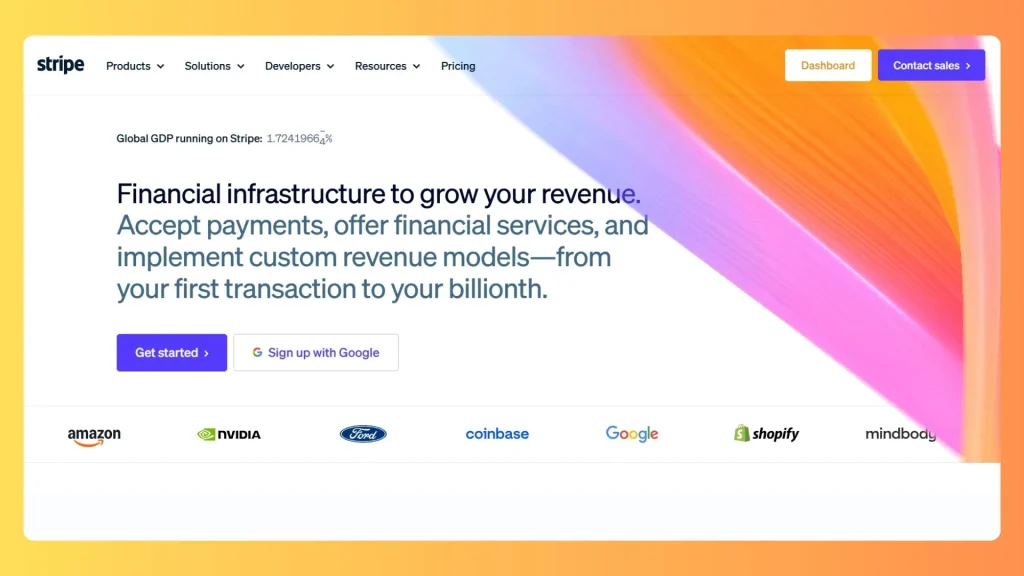
Best for: Online businesses and software companies that need detailed payment reporting, subscription and payout visibility, and developer tools such as logs and test mode, all inside one well organized dashboard.
The Stripe Dashboard is the reference for financial tables. It combines a revenue summary with payment lists, balances, payouts, and disputes. It also includes a switch between test and live environments that developers rely on. Color is used mostly for state: succeeded, refunded, failed.
What makes it work
- Tables lead, charts summarize. The home view gives a quick read on revenue, then lets you move straight into the underlying payments.
- Drill downs keep context. You can move from a summary into a single record and back without losing your place.
- Status chips are consistent. The same small labels appear across payments, invoices, and disputes, so users learn the vocabulary once.
- Developer tools sit inside the product. API keys, logs, and webhooks live in the same dashboard as the business data.
| Dashboard area | What it does |
|---|---|
| Home | Revenue summary, balance, recent payments |
| Payments and balances | Payment lists, payouts, fees |
| Customers and billing | Subscriptions, invoices, customer records |
| Disputes and fraud tools | Case queues and risk review |
| Reports | Exportable financial reports |
| Developers | API keys, logs, webhooks, test mode |
The details that build trust
Financial tables live or die on small typographic choices. Right aligned amounts let the eye compare values down a column. Tabular figures keep digits the same width so decimals line up. Currency formatting stays consistent everywhere. None of this is decoration. It reduces reading errors, and in a product that handles money, a misread number is a real cost.
Subscriptions and billing states
If your product bills customers on a schedule, study how Stripe presents states such as active, past due, and canceled, and how it makes failed payments easy to find and act on. When billing rules go beyond standard plans, such as contract specific schedules or usage based tiers, teams often look at custom recurring billing software development to fit the dashboard to their own logic.
Pattern to borrow: tabular figures, right aligned amounts, and status chips used consistently.
Limitation: the dashboard is built around Stripe’s own payments and billing model. It is not a general ledger, so teams with complex accounting needs usually pair it with other systems.
4. Ramp
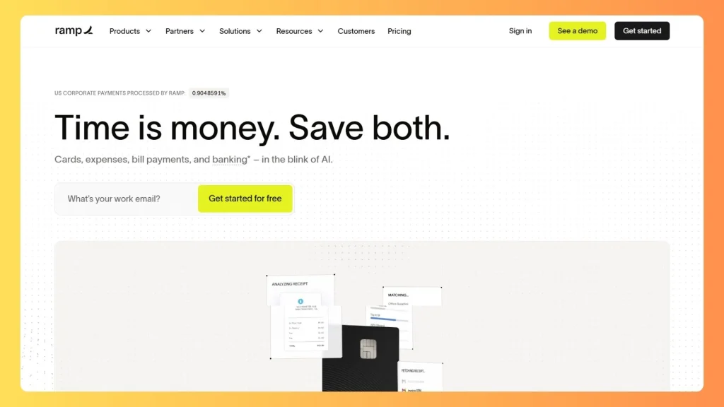
Best for: Finance and operations teams that want to control company spending, match receipts, code expenses, route approvals, and sync everything to their accounting system from a single work queue.
Ramp organizes its interface around what finance teams actually do: approve, match receipts, code expenses, and close the books. It also covers bill pay and connects to accounting systems, so the dashboard shows work remaining before it shows charts.
Why the work queue matters
Most finance dashboards start with charts and leave the work to the user. Ramp reverses the order. The first thing a finance manager sees is what needs attention today: missing receipts, items awaiting approval, and transactions that still need a category. Charts and trends sit behind that, available when someone wants context. This suits the reality of finance work, which is a steady flow of small decisions rather than occasional deep analysis.
A typical expense moves through these stages, and the dashboard makes each one visible:
| Stage | What the user sees | Owner |
|---|---|---|
| Card swipe | Transaction appears with merchant and amount | Employee |
| Receipt match | Missing receipt flag | Employee |
| Coding | Suggested accounting category | Finance |
| Approval | Item in approver queue | Manager |
| Sync | Posted to accounting system | Finance |
What to notice in the design
- Ownership is explicit. Every stage names who has to act, which removes the guesswork of who is holding things up.
- Suggestions reduce effort. Proposing a category or matching a receipt turns a manual task into a quick confirmation.
- The end state is clear. An item is finished when it reaches the accounting system, and the dashboard shows that endpoint.
How to apply it
Map your own process from the moment money leaves to the moment it is recorded. Each step where something can stall becomes a queue on the dashboard. Teams that need this kind of sync with their own ledger often end up scoping custom accounting software development.
Pattern to borrow: the work queue. Treat a finance dashboard as a to do list with charts underneath.
5. Brex
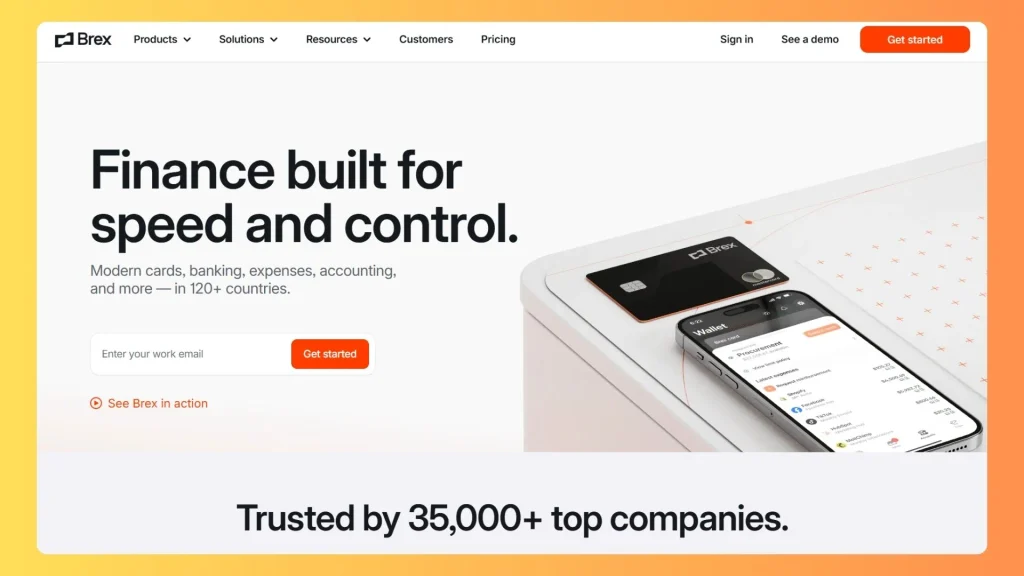
Best for: Larger companies with several teams, entities, and spending policies, where controllers need budgets, approvals, and policy exceptions surfaced quickly instead of digging through every transaction.
Brex serves controllers who manage many teams, entities, and policies. The design goal is to show what needs attention and hide what is on track, keeping a dozen dimensions readable through strong hierarchy.
The problem it solves
As a company grows, the number of things a finance leader could look at grows faster than the time available. Ten teams, several entities, different currencies, and layered spending policies produce thousands of data points. Showing all of them creates noise. Brex’s approach is to define what normal looks like and then surface only the departures from it. A controller does not need to see that a team is within budget. They need to see that a team is about to go over.
| Exception type | Example trigger | Dashboard behavior |
|---|---|---|
| Policy breach | Spend above a category limit | Flag on the overview with owner |
| Missing documentation | Receipt not attached | Reminder queue |
| Budget risk | Team close to its budget | Warning on budget card |
| Unusual activity | Out of pattern merchant | Review item |
What to notice in the design
- Hierarchy over volume. Headline figures come first, and detail opens on demand.
- Every flag has an owner. An exception without a named person tends to sit unresolved.
- Filters match how the company is organized. Team, entity, and category views mirror real reporting lines.
How to apply it
Write down your rules before you design the screen. An exception first dashboard is only as good as the definition of an exception, so agree the thresholds with finance leadership first. Then build views that show the flagged items, who owns them, and how long they have been open.
The same idea drives claims triage, where reviewers need flagged cases before routine ones, as covered in custom claims management software development.
Pattern to borrow: exception first design. Show what needs attention and hide what is on track.
6. Wise Business

Best for: Businesses that hold, send, and receive money in multiple currencies and want clear balance cards, visible exchange rates, and fee breakdowns shown before they confirm any transfer.
Wise solves a hard layout problem: many currencies, balances, and transfer states in one view. It uses balance cards, mid market rate references, and fee breakdowns shown before the user commits to a transfer.
The multi currency challenge
A business that operates across borders faces confusion at every step. Which currency does this balance hold? What rate applies? What will the recipient actually receive, and when? Products that answer these questions late create anxiety and support requests. Wise answers them before the user commits, which turns a stressful moment into a routine one.
| Fee element | Why it belongs on screen |
|---|---|
| Amount sent | Anchors the calculation |
| Fee | Shown as its own line |
| Exchange rate | Stated explicitly |
| Amount received | The number the recipient gets |
| Expected arrival | Sets timing expectations |
What to notice in the design
- Balance cards. Each currency gets its own card, so users see holdings at a glance without decoding a long list.
- Itemized costs. Separating the fee from the rate lets users check the math instead of trusting it.
- A plain data layer under a strong brand. The visual identity is bold, but the numbers themselves are presented simply and consistently.
- Timing expectations. Showing when money will arrive answers the question users care about most after the cost.
How to apply it
Any product that moves money should apply the same order: show what the user sends, what it costs, what the other side receives, and when. Do this before the confirm button, not after. Hiding costs until the last step may lift short term conversion, but it damages trust and generates disputes.
Pattern to borrow: show cost before confirmation. Transparency is a design decision, not only a policy.
7. Revolut Business
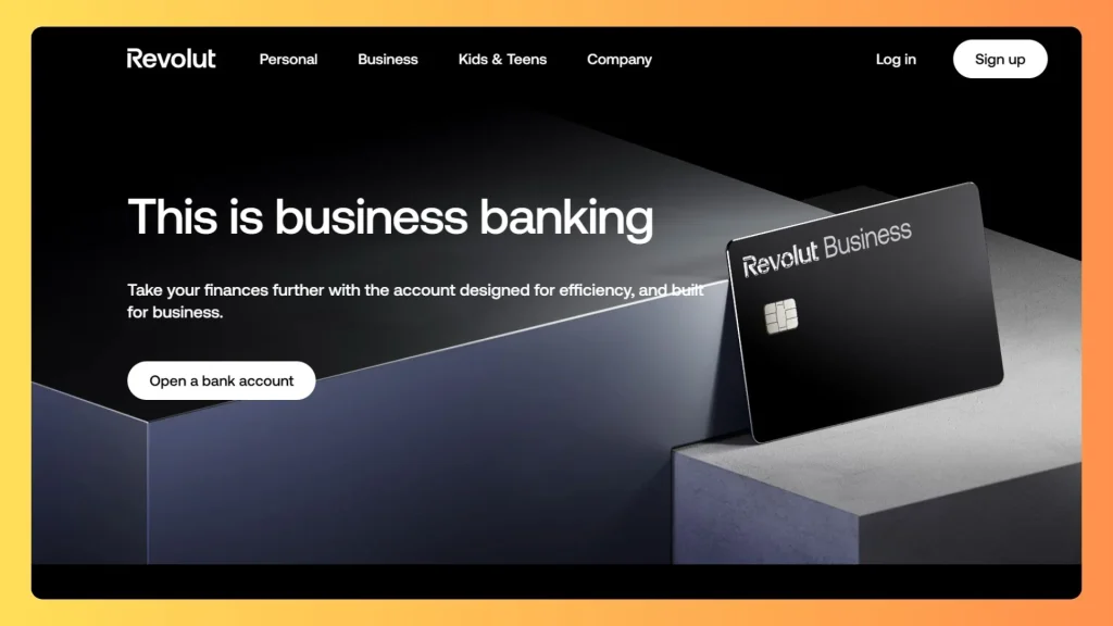
Best for: Teams that want cards, foreign exchange, spend management, and treasury in one app, and power users who spend long sessions in a dark, high contrast interface.
Revolut Business brings cards, foreign exchange, spend, and treasury into one app with high contrast numerals and card based panels. The dark interface suits power users who spend hours in the product.
Why dark works here
Dark interfaces reduce glare during long sessions, and they make bright numerals and status colors stand out sharply. For people who monitor balances, exchange activity, and card spend throughout the day, that contrast helps them scan quickly. Card based panels add structure, so each product area, such as cards, transfers, or treasury, reads as a separate unit instead of one dense wall of data.
What to notice in the design
- Numerals carry the page. Large, bright figures against a dark background make balances readable at a glance.
- Panels separate functions. Cards, exchange, and spend each have their own container, which prevents crowding.
- One app for many jobs. Combining several finance functions works because the navigation stays consistent.
Where dark interfaces go wrong
| Risk | What happens | Fix |
|---|---|---|
| Small gray secondary text | Falls below readable contrast | Test against the 4.5 to 1 minimum |
| Pure black backgrounds | Harsh glare and heavy contrast | Use a softened dark tone |
| Red and green on dark | Colors lose separation for some users | Add icons or labels beside color |
| Thin fonts | Strokes disappear on dark | Use a medium weight for numbers |
How to apply it
Treat dark mode as a full design system and not an inverted copy of the light theme. Choose colors for the dark background from the start, then test every text color against the contrast ratios in the accessibility section below.
Pattern to borrow: contrast discipline. Dark financial UI lives or dies on how readable the numbers are, especially small gray secondary text.
8. Plaid
Best for: Developers and product teams building apps on top of bank data who need to monitor API usage, connection health, error rates, and separate testing and live environments in one console.
Plaid connects apps to bank accounts, and its dashboard serves the builders. It includes usage information, logs, Link customization, team management, and separate Sandbox and Production environments.
A dashboard for builders, not account holders
Most dashboards in this list face customers who want to see their money. Plaid’s faces developers who need to know whether their integration works. The questions are different: are users completing the bank connection flow, which institutions are failing, and how much of the product are we using? A useful developer dashboard answers those questions without forcing anyone to read raw logs first.
The data path behind a Plaid powered product looks like this:
| Step | Component | What the dashboard exposes |
|---|---|---|
| 1 | End user opens Link in your app | Conversion and error rates |
| 2 | User authenticates with their bank | Institution level connection health |
| 3 | Your server exchanges a token | API request logs |
| 4 | Your app retrieves account data | Usage per product |
| 5 | Your system stores and displays it | Your own dashboard layer |
What to notice in the design
- Environment separation. Sandbox and Production are clearly distinct, which prevents test activity from being mistaken for live activity.
- Health states. Connection status and error rates appear as first class information, not something buried in a report.
- Team controls. Access management sits in the same console, which matters when several engineers share an account.
How to apply it
If you build an operations console over financial data, treat health as a headline metric. Show whether connections are working, how many requests failed, and which integrations need attention. Users of financial products notice failures immediately, so your own team should see them first.
Pattern to borrow: visible health states. Show connection status, error rates, and environment clearly.
9. Robinhood
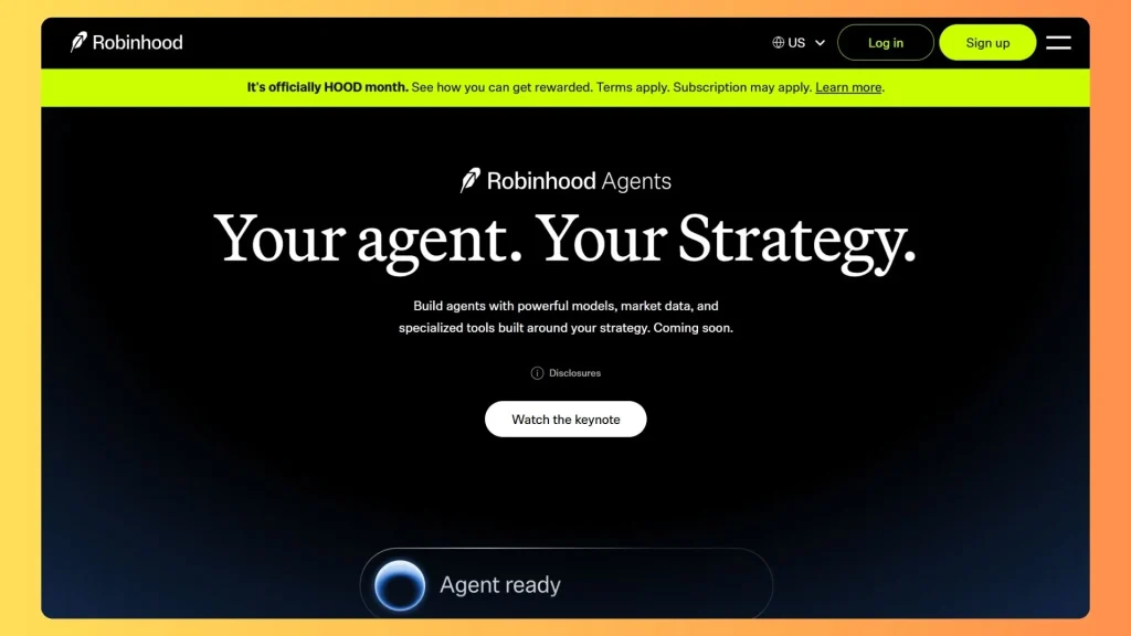
Best for:New and casual investors who want a simple portfolio view, smooth interactive charts, and a low clutter layout that reveals more detail only when they ask for it.
Robinhood made investing feel approachable with smooth interactive charts, a simple portfolio view, and a low clutter layout. A reduced feature surface can lower the barrier for new users.
Why simplicity worked
Traditional brokerage screens often present dozens of controls, tabs, and data columns at once. For a first time investor, that reads as a warning that the product is not for them. Robinhood answered with a clear hierarchy: your total value and today’s change first, a chart to show the trend, and your holdings below. The interface asks users to understand very little before they can see how they are doing.
| Layer | Content | Purpose |
|---|---|---|
| Primary | Portfolio value and daily change | Immediate answer |
| Secondary | Chart with range selector | Context |
| Tertiary | Holdings list, watchlist | Action |
| On demand | Order details, statistics | Depth without clutter |
What to notice in the design
- A single headline number. Everything else supports it.
- A range selector on the chart. Users switch between short and long time frames without leaving the page.
- Hover and touch feedback. Interactive charts respond smoothly, which makes data feel approachable.
- Depth kept out of sight. Advanced statistics exist but only appear when someone asks for them.
How to apply it
Progressive disclosure works best when you know who your users are. For beginners, hide complexity and reveal it gradually. For experienced investors, the opposite is true: they want density and speed. Decide which group you serve first, then set the default depth accordingly. Products with deeper needs such as allocation, rebalancing, and reporting move toward custom investment portfolio management software.
Pattern to borrow: progressive disclosure. Lead with portfolio value and change, then reveal detail on demand.
10. BILL
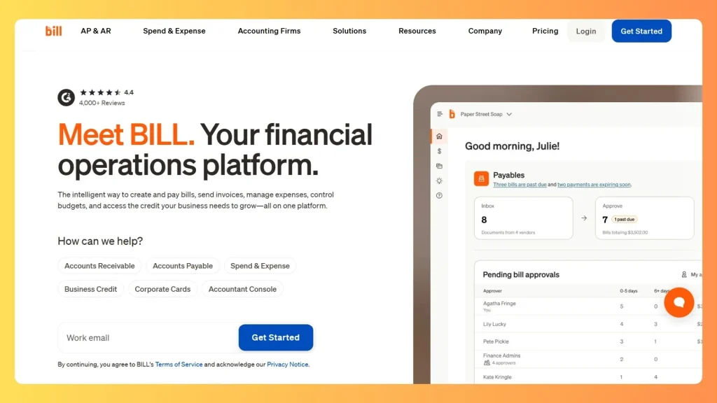
Best for: Small and mid size businesses that manage accounts payable and receivable and want bills, approval routing, payment scheduling, and accounting sync in one place, with a clear status trail from received to paid.
BILL focuses on the accounts payable and receivable cycle for small and mid size businesses: bills due, approval routing, payment scheduling, and sync with accounting tools. It is a strong reference for anyone researching fintech platforms for easy bill pay.
The problem with paying bills manually
Paying bills sounds simple until a business has dozens of vendors, several approvers, and a due date on every invoice. Invoices arrive by email, approvals happen in chat, payments go out from the bank portal, and someone updates the books afterward. Every handoff is a chance for a late payment, a duplicate, or a missing record. A bill pay dashboard replaces those scattered steps with one trail.
| Bill status | Meaning | Next action |
|---|---|---|
| Received | Invoice captured | Review and code |
| Pending approval | Waiting on an approver | Approve or reject |
| Approved | Ready to schedule | Choose payment date and method |
| Scheduled | Payment set to send | Monitor |
| Paid | Funds sent | Reconcile with accounting |
What to notice in the design
- Status as the organizing idea. Users can see at once how many bills sit in each stage.
- Due dates stay visible. Late fees and strained vendor relationships come from missed dates, so timing is never hidden.
- Approvals are recorded. The system keeps track of who approved what and when, which supports audits.
- Accounting sync closes the loop. A bill is only finished once it is reconciled, and the dashboard treats it that way.
How to apply it
If you are designing a bill pay experience, build the status timeline first and let every screen hang from it. Add reminders for items stuck in a stage too long, and make the next action obvious on each row.
Pattern to borrow: the approval trail. Show who approved, when, and what happens next, with a clear status timeline from received to paid.
How a Fintech Dashboard Is Built: Reference Architecture
Every example above sits on the same layered structure. Knowing it helps you judge whether a template can cover your case.
| Layer | Responsibility | Typical components |
|---|---|---|
| Presentation | Screens, charts, tables, themes | Web front end, component library, charting |
| API | Secure access to data and actions | REST or GraphQL endpoints, authentication, rate limits |
| Business logic | Rules that define your product | Approval limits, fee calculation, payment schedules |
| Data and ledger | System of record | Relational database, double entry ledger, audit log |
| Integrations | Outside systems | Banks, payment processors, accounting tools, identity checks |
| Security and compliance | Controls across every layer | Role based access, encryption, logging, PCI DSS scope |
Data flows through those layers in a consistent order:
| Step | Flow |
|---|---|
| 1 | User action in the interface → API request |
| 2 | API checks identity and permissions → business logic |
| 3 | Business logic validates the rule → writes to the ledger |
| 4 | Ledger event → notification and audit log |
| 5 | Updated state → dashboard refresh |
Templates only cover the first row. The other five are where cost, risk, and compliance live, which is why the build or buy decision below matters.
Design Patterns That Work Across Fintech Dashboards
- Color means state, nothing else. Reserve green, red, and amber for gains, losses, and warnings.
- Numerals are the typography that matters. Use tabular figures, consistent decimal places, and right aligned columns so amounts compare at a glance.
- Design the pending state. Money is often in flight. Vague “processing” labels create support tickets, so show a timeline with expected completion. Lending products face this daily with payment schedules and overdue buckets, a theme in custom loan servicing software development.
- Put trust in microcopy. Show fees before confirmation, exact timestamps, and explicit exchange rates.
- Show insured status carefully. In the United States, standard FDIC deposit insurance covers up to $250,000 per depositor, per insured bank, per ownership category. If you display it, say clearly who holds the funds.
- Keep states consistent. Empty, loading, error, and success states should look the same everywhere.
Performance and Accessibility Benchmarks
Slow or hard to read dashboards lose trust fast. These are published thresholds worth designing to:
| Metric | Target | Source |
|---|---|---|
| Largest Contentful Paint | 2.5 seconds or less | Google Core Web Vitals |
| Interaction to Next Paint | 200 milliseconds or less | Google Core Web Vitals |
| Cumulative Layout Shift | 0.1 or less | Google Core Web Vitals |
| Normal text contrast | At least 4.5 to 1 | WCAG |
| Large text contrast | At least 3 to 1 | WCAG |
If your dashboard handles card data, also check your scope against PCI DSS, whose newer requirements are now mandatory.
Light or Dark: Choosing a Theme for Financial Data
| Product situation | Better default | Why |
|---|---|---|
| Trading and treasury tools | Dark | Long sessions, dense real time data |
| Occasional use business banking | Light | Familiar, print friendly, easier for casual users |
| Developer consoles | Both | Users choose their own environment |
| Billing and invoicing | Light | Documents and exports are usually light |
Support both themes where you can, and test each against contrast requirements.
Template or Custom Build: How to Decide
Searches for a fintech dashboard template, Figma file, GitHub starter, or admin dashboard usually mean you want a head start. Here is how the options compare.
| Option | Best for | Watch out for |
|---|---|---|
| Community Figma files | Fast concept and stakeholder review | Layouts may ignore real data density |
| Open source GitHub starters | Prototypes and internal tools | License, maintenance, dependencies |
| Free admin templates | Basic layouts and charts | Rarely include security or audit features |
| Premium fintech themes | Faster launch with polished UI | Customization limits and license terms |
| Custom build | Complex workflows and compliance | Higher upfront effort |
Checklist before choosing a template:
- Does the license allow commercial use?
- Are tables sortable, filterable, and keyboard accessible?
- Do charts handle currency formats and negative values?
- Is each theme tested for contrast?
- Is the codebase actively maintained?
- Who owns security review, audit logging, and role permissions?
Signs a template will not be enough:
- Your dashboard must reconcile with a ledger, not just display numbers.
- Approval rules change by amount, team, or region.
- You operate in a regulated vertical such as lending or insurance. Insurers, for example, tie premium schedules and reconciliation to policy data, which is the territory of insurance billing software development.
Final Thoughts
A great fintech dashboard is not the one with the most charts. It is the one that lets someone check their money, understand what is pending, and act with confidence in a few seconds. The best fintech dashboard website examples in this guide prove it: Mercury through calm, Stripe through clear tables, Ramp and BILL through approval workflows, Brex through exceptions, and Wise Business through honest fees.
Use them as taste references, not blueprints. Templates and Figma files can speed up the screens, but the ledger, rules, integrations, and security underneath decide whether users trust the product. If your workflow is too specific for a template, a scope review with a custom finance software development company like DevSouq can show which parts to reuse and which to build around your own data. Start with your users’ first question, design the answer to it, and let every other widget earn its place.
FAQs
What makes a good fintech dashboard?
A good fintech dashboard answers one question fast: is my money okay? It leads with a balance or net position, surfaces pending items, uses color only for status, and keeps tables easy to scan. Clear fees and exact timestamps add the trust financial users expect.
What should a banking dashboard show?
A banking dashboard should show total balance with trend, money in motion such as pending payments, a cash flow chart, a filterable transaction table, and alerts for failed or flagged items. Anything that changes the balance should be visible without extra clicks.
What is the best fintech website?
There is no single winner. Stripe is a top pick for clear developer focused design, Wise for transparent fees, and Mercury for calm business banking. The best one depends on your audience and goal, so match the site to your product type.
What are some of the best website dashboards?
Strong examples include Stripe for payment tables, Mercury for calm banking views, Ramp for spend workflows, Brex for exception tracking, and Wise Business for multi currency balances. Each solves a different layout problem, so choose by product type.
What are the top 5 dashboard tools?
Five widely used tools are Microsoft Power BI, Tableau, Looker Studio, Metabase, and Grafana. Power BI and Tableau suit business reporting, Looker Studio suits quick shareable reports, Metabase suits simple self serve analytics, and Grafana suits monitoring data.
What is a good dashboard for financial analysis?
Power BI and Tableau are common picks because they connect to spreadsheets, databases, and accounting data. A good financial dashboard shows cash flow, budget against actual, revenue trends, and variances, with filters by period and team. Excel still works for smaller teams.